Welcome to our comprehensive guide to layering colors in coloring pages. If you’re a coloring enthusiast looking to elevate your artistry, understanding the nuances of color palettes, blending techniques, and the art of contrast is essential. In this article, we’ll delve into the intricacies of creating and customizing your color palette, mastering blending and layering techniques, and adding personal touches to your artwork. Whether you’re a beginner seeking inspiration or a seasoned colorist looking to refine your skills, this guide will equip you with the tools and knowledge to take your coloring pages to the next level.
So, let’s dive into the world of layering colors and unleash your creative potential.
Key Takeaways:
Introduction to Layering Colors in Coloring Pages
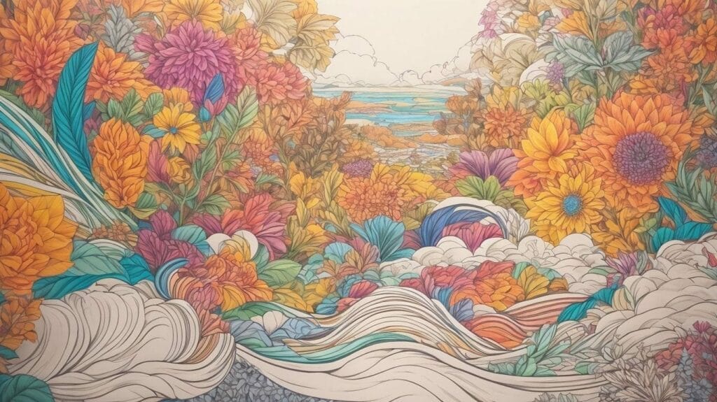
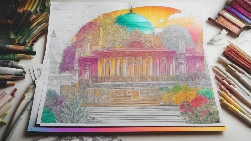
Layering colors in coloring pages is a sophisticated technique that adds depth and richness to the artwork, creating visually stunning and dynamic compositions that captivate the eye and evoke emotional responses from the viewer.It involves the strategic application of markers, pencils, watercolors, or acrylics to build layers of color, achieving a sense of dimension and luminosity. By overlaying colors, artists can create subtle gradations and transitions, enhancing the visual interest of the artwork. The contrast between light and dark shades can bring emphasis to certain aspects of the design, effectively guiding the viewer’s gaze and conveying a sense of depth.
Skillful use of layering also allows for the depiction of various textures, from soft gradients to bold, vibrant hues, adding complexity and visual intrigue to the composition.
Understanding Color Palettes
Color palettes are essential tools for artists and designers, encompassing a harmonious selection of colors that convey specific themes, moods, and emotions within the artwork.
By skillfully choosing complementary colors, artists can evoke strong contrasts, while analogous palettes create harmonious and calming visuals.
The triadic scheme offers dynamic combinations, and monochromatic palettes provide a sense of elegance and simplicity.
Understanding the influence of shading, blending, and color temperatures allows for enhancing depth and realism within the artwork, leading to a more engaging and impactful visual experience.
What are Color Palettes?
Color palettes refer to a carefully curated selection of colors that artists and designers use to convey specific themes, emotions, or visual narratives within their artwork. These palettes serve as the foundation for creating harmonious compositions and evoking desired responses from the audience.
The use of color palettes can be found across various art forms, such as painting, graphic design, interior decoration, and even digital media. For instance, the Monet color palette is known for its gentle pastel tones and soft, complementary hues, capturing the tranquility of nature in impressionist art. On the other hand, the bold and contrasting colors in the Pop Art movement, exemplified by artists like Andy Warhol, aimed to challenge traditional perceptions and symbolism through vibrant, eye-catching combinations.
Types of Color Palettes
Various types of color palettes exist, ranging from monochromatic and analogous schemes to complementary and triadic combinations, each offering unique opportunities for creative expression and visual impact. Artists and designers often leverage these different palettes to evoke specific emotions or convey distinct visual narratives.Monochromatic palettes, like in Picasso’s ‘The Old Guitarist,’ use variations of a single color, creating a harmonious and soothing visual effect. On the other hand, analogous palettes, exemplified in Vincent van Gogh’s ‘Sunflowers,’ blend adjacent colors on the color wheel for a sense of unity and warmth. Complementary palettes, seen in works like Wassily Kandinsky’s ‘Composition VIII,’ juxtapose colors opposite each other on the color wheel, creating vibrant and dynamic contrasts. Triadic palettes, as in Henri Matisse’s ‘Luxe, Calme et Volupté,’ involve three equidistant hues on the color wheel, producing a balanced yet striking composition.
Creating Your Color Palette
Crafting a unique and compelling color palette involves a thoughtful process of theme selection, color limitation, and inspiration seeking, enableing artists and designers to breathe life and personality into their artwork through intentional color choices. By aligning the palette with the intended theme and limiting the color range, creators can channel their artistic vision with clarity and impact.One practical tip for finding inspiration for your color palette is to observe nature. The natural world offers an abundance of harmonious color combinations that can serve as a guiding source for your own palette. Studying the works of renowned artists such as Vincent van Gogh, known for his bold and vibrant color usage, or Georgia O’Keeffe, celebrated for her mastery of muted yet impactful tones, can provide valuable insights into the power of color in art.
Integrate aspects of the environment and personal experiences into your color choices, infusing the palette with your unique perspective and narrative. When integrating personal touches into the color palette creation process, consider leveraging cultural influences, childhood memories, or emotional experiences to infuse deeper meaning into the chosen colors. By infusing personal elements into the palette, artists and designers can imbue their creations with a distinctive and authentic essence, setting their work apart and resonating with viewers on a deeper level.
Deciding the Theme
Selecting a theme is the foundational step in creating a compelling color palette, as it sets the tone, mood, and visual direction for the artwork. Artists and designers draw inspiration from various sources such as nature, culture, or personal experiences to articulate a theme that resonates with their creative vision and emotional expression.
The chosen theme serves as a guiding principle for color selection and arrangement, influencing the overall emotional resonance of the piece.
For example, in Monet’s ‘Water Lilies’ series, the theme of tranquility and natural beauty is masterfully reflected in the soft, harmonious color palette of blues, greens, and purples.
On the other hand, the theme of passion and drama in Van Gogh’s ‘Starry Night’ is vividly portrayed through the intense contrast of deep blues, yellows, and swirling whites.
Limiting the Number of Colors
Constraining the color range within a palette is a strategic approach that fosters coherence, emphasis, and visual impact within the artwork. By limiting the number of colors, artists and designers can amplify the expressiveness of each hue and create a more focused and compelling visual experience for the audience.
When selecting a limited color palette, it’s crucial to consider the psychological impact of colors and the harmony they create. By carefully choosing a few key colors, the artist can ensure that the overall composition is coherent and visually appealing. Color psychology plays a significant role, so understanding the emotions and associations tied to different hues is vital for making informed choices.
Strategic use of complementary colors can add dynamic contrast and vibrancy to the artwork without overcrowding the visual space. This technique allows the artist to create impactful focal points and guide the viewer’s attention with precision.
Finding Inspiration
Seeking inspiration is an integral part of the color palette creation process, as it fuels creativity, imagination, and innovation.
Renowned artists may find inspiration for their color palettes in sunsets, using a blend of warm oranges, pinks, and purples to capture the breathtaking hues. Meanwhile, designers may draw from urban landscapes, infusing their palettes with bold, modern tones reflective of the city’s energy.
Cultural festivities such as traditional celebrations and rituals also serve as stimuli, leading to vibrant and rich color combinations in artworks and design projects.
The Art of Blending Colors
Blending colors in artwork is a masterful technique that involves seamlessly integrating different hues and tones to achieve smooth transitions, depth, and visual vibrancy. Whether through subtle shading or bold contrasts, artists employ blending techniques to elevate the visual impact and emotional resonance of their creations, infusing them with depth and dimension.
One striking example of expert color blending can be observed in Vincent van Gogh’s iconic ‘Starry Night,’ where swirling blues and yellows merge harmoniously to evoke a sense of celestial wonder. Similarly, Georgia O’Keeffe’s floral paintings masterfully blend vibrant petals with subtle gradations, immersing the viewer in the essence of each bloom. Whether it’s using markers, pencils, watercolors, or acrylics, artists experiment with various blending tools to unlock the full potential of color blending, creating captivating and evocative works of art.
Gradation and Depth
The art of gradation and depth in color blending enables artists to imbue their artwork with visual dynamism, three-dimensionality, and emotional depth. By skillfully transitioning between shades and tones, creators evoke a sense of movement, perspective, and narrative within their compositions, captivating the viewer’s imagination and emotions.Creating effective gradation and depth requires an understanding of the interplay between light and shadow. By varying the intensity of colors, artists can convey the illusion of distance, form, and texture. Contrast is essential to achieving depth; blending light and dark hues creates visual interest and highlights focal points. Strategic use of shading techniques such as hatching, cross-hatching, or stippling can enrich the tonal range, making the artwork more compelling and realistic. To master color blending, consider experimenting with complementary and analogous color schemes, as they can enhance gradation and depth in captivating ways.
Layering Techniques
Various layering techniques, such as glazing, scumbling, and impasto, offer artists diverse methods for applying and blending colors, each contributing unique textures, visual effects, and expressive qualities to the artwork. Utilizing different tools such as markers, pencils, watercolors, and acrylics, creators can experiment with layering techniques to achieve desired aesthetic and emotional impact.Glazing involves applying thin, transparent layers of paint to create depth and luminosity, often utilized in oil painting to achieve rich, vibrant color variations. In contrast, scumbling consists of lightly dragging a dry brush with opaque paint over a dry underlayer, creating a textured, hazy effect perfect for representing atmospheric elements or softening edges. Impasto, characterized by thick, heavily textured applications of paint, allows for pronounced three-dimensional surface and adds a tactile quality to the artwork.
Renowned artists such as Rembrandt and Vincent van Gogh masterfully utilized impasto, creating dynamic, expressive works that evoke intense emotions and tactile sensations. Similarly, the meticulous glazing techniques of Titian and Vermeer are celebrated for their subtle gradations and luminous effects, showcasing the versatility and impact of layering methods.
Embracing Contrast
Contrast is a fundamental element in creating impactful and visually arresting artwork, as it infuses compositions with dramatic tension, focal points, and emotional resonance.
One powerful contrast technique is the interplay of light and dark values, which creates depth and adds a dynamic quality to the artwork. For instance, in Caravaggio’s ‘The Calling of Saint Matthew,’ the dramatic use of light and shadow intensifies the emotional impact of the scene.
Another effective approach is the juxtaposition of warm and cool colors, where warm hues advance and cool tones recede. This can be observed in Vincent van Gogh’s ‘Starry Night,’ where the vibrant warm yellows and oranges contrast with the cool blues, enhancing the visual impact and adding emotional depth.
Artists manipulate tonal variations to create subtle yet compelling contrasts, such as the delicate shading in Leonardo da Vinci’s ‘Mona Lisa,’ which contributes to the enigmatic allure of the portrait. These examples underscore the significance of contrast in creating visually striking and emotionally resonant artwork.
Using Light and Dark
Effective use of light and dark elements in artwork allows artists to create compelling contrasts, depth, and visual engagement, elevating the overall impact of the composition.By applying varying levels of pressure and layering techniques, artists can achieve rich tonal variations and depth, playing with the intensity of light and shadow to draw the viewer into the scene. The juxtaposition of opaque and translucent mediums, such as combining colored pencils with watercolor washes or layering acrylic paint over pencil work, can further amplify the dramatic effect of light and dark interplays, enhancing the atmospheric ambiance and emotional resonance of the artwork.
Warm vs. Cool Colors
The juxtaposition of warm and cool colors in artwork allows creators to evoke distinct moods, atmospheres, and emotional responses within their compositions.By skillfully harmonizing shades like radiant reds, vibrant oranges, and sunny yellows with serene blues, tranquil greens, and calming violets, artists infuse their artwork with visual variety, tonal contrast, and expressive depth, enriching the viewer’s experience and engagement with the piece.
For instance, renowned pieces such as Vincent van Gogh’s ‘Starry Night’ artfully juxtapose the warmth of the glowing stars against the cool tones of the night sky, creating a mesmerizing sense of cosmic wonder. Similarly, Henri Matisse’s ‘The Dance’ expertly employs warm and cool color harmonies to convey a lively and jubilant atmosphere, enhancing the emotional impact of the scene.
Adding Personal Touches
Infusing personal touches into color palettes and artwork allows artists and designers to imbue their creations with unique perspectives, sentiments, and creative identities. By customizing color palettes, experimenting with textures, and exploring innovative applications of contrast and shading, creators manifest their artistic visions with authenticity and expressive impact.
When artists infuse their personal elements into their color palettes, the results can be truly remarkable. Take Vincent van Gogh, for instance, whose use of bold and expressive colors conveyed his passionate and emotional approach. Similarly, Claude Monet‘s fascination with light and shadow led to his innovative application of contrasting colors in his Impressionist masterpieces. Their personal touches not only defined their art but also left a lasting impression on the world. By incorporating their unique perspectives and experimenting with textures, creators can bring a new level of depth and individuality to their work.
Customizing Your Palette
Customizing a color palette involves tailoring the selection of colors, textures, and tonal variations to align with the artist’s or designer’s unique creative vision and expressive intent. By infusing personal preferences, experiences, and emotional resonances into the palette, creators create artwork that authentically reflects their artistic identity and narrative.
Individuals have the opportunity to imbue their creations with emotional depth by carefully curating a harmonious blend of hues that evoke specific feelings or memories. Whether selecting bold, vibrant shades or soft, subtle tones, the intimate connection between the creator and their chosen colors is what breathes life into the artwork. Each stroke of the brush and every carefully arranged composition becomes an extension of their inner world, where creativity meets emotional resonance.
By sharing personal experiences and perspectives, artists and designers can inspire others to embrace the beauty of personalized color palettes and the meaningful stories they encapsulate.
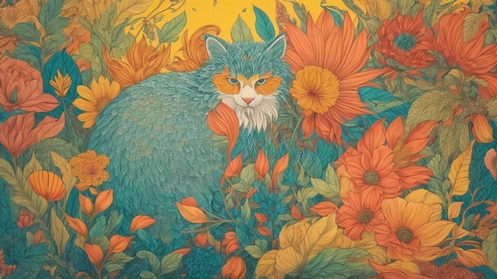
Experimenting with Textures
Artists and designers often experiment with various textures in color application, leveraging tools such as markers, pencils, watercolors, and acrylics to create tactile and visual richness within their artwork.
By encompassing a variety of techniques in texture experimentation, creators can achieve an extraordinary range of effects. For instance, layering watercolors can result in delicate, translucent textures, while using impasto techniques with acrylics creates bold, sculptural surfaces. Employing different paper surfaces, such as rough watercolor paper or smooth Bristol board, can yield diverse textural outcomes.
Artists also explore unconventional tools like sponges, palette knives, and even everyday items like plastic wrap and old credit cards to impart unique textures to their pieces. These methods open up a world of possibilities for integrating texture experimentation into artistic expressions, giving rise to rich, multi-dimensional visual experiences.
Conclusion and Further Resources
Mastering the art of layering colors in coloring pages offers artists and designers a powerful means of creating visually captivating and emotionally resonant artwork. By understanding color palettes, blending techniques, contrast, and shading, creators can elevate their compositions to new heights of artistic expression and aesthetic appeal.Understanding color palettes enables creators to harmoniously blend colors to evoke specific moods and atmospheres within their artwork. Experimenting with the interplay of hues, tones, and saturations opens avenues for nuanced expression and depth. Honing blending techniques contributes to seamless transitions between colors, enriching visual narratives and enhancing realism.
Integrating contrast within layered compositions imparts dynamism and focal points, drawing viewers into the intricate details of the artwork. The thoughtful application of light and shadow through shading adds dimension and volume, breathing life into flat surfaces and imbuing them with a tactile quality.
For those seeking to expand their mastery, exploring transparent medium applications expands the repertoire of layering techniques, inviting experimentation with light and translucency. Workshops, tutorials, and collaborative projects serve as invaluable resources for continued learning and the discovery of innovative color layering approaches, fostering growth and artistic evolution.
FAQs about Layering Colors in Coloring Pages
Exploring frequently asked questions about layering colors in coloring pages provides valuable insights for artists and designers seeking to refine their techniques and expand their creative horizons. From essential tips on color selection and blending to practical considerations for utilizing tools such as markers, pencils, watercolors, and scrap paper, these FAQs offer comprehensive guidance for navigating the intricacies of color layering in artistic creations.One fundamental aspect to consider when layering colors is the selection of a suitable color palette. Opting for complementary or analogous colors can enhance the depth and vibrancy of the final artwork. Understanding color theory and the emotional impact of different hues can greatly influence the overall visual impact.
Blending techniques play a crucial role in achieving seamless transitions between colors. This can be achieved through various methods such as hatching, cross-hatching, stippling, or using blending tools like blending stumps or brushes to create a smooth gradient.
It’s also essential to consider the type of artistic tools being used. For instance, markers provide vibrant and opaque layers, while pencils allow for precise detailing and layering, and watercolors lend a transparent and fluid quality to the artwork. The choice of paper also affects the layering process, with textured papers adding dimension and smooth papers allowing for finer details.